
Color is one of the most powerful tools in Minecraft building. Before a single block is placed, the color palette you choose quietly decides the mood, realism, and emotional impact of your build. A well-planned palette can turn a simple house into a cozy dream home, a castle into a dramatic landmark, or a village into a living, breathing world.
Many Minecraft players struggle not with structure—but with color harmony. Too many colors feel messy. Too few feel boring. The secret lies in selecting a balanced palette that supports your theme, lighting, biome, and story.
This article explores amazing Minecraft color palette ideas, each crafted for realism, beauty, and Pinterest-worthy aesthetics. Whether you’re building for survival, creative mode, or content creation, these palettes will help your builds feel intentional, immersive, and visually stunning.
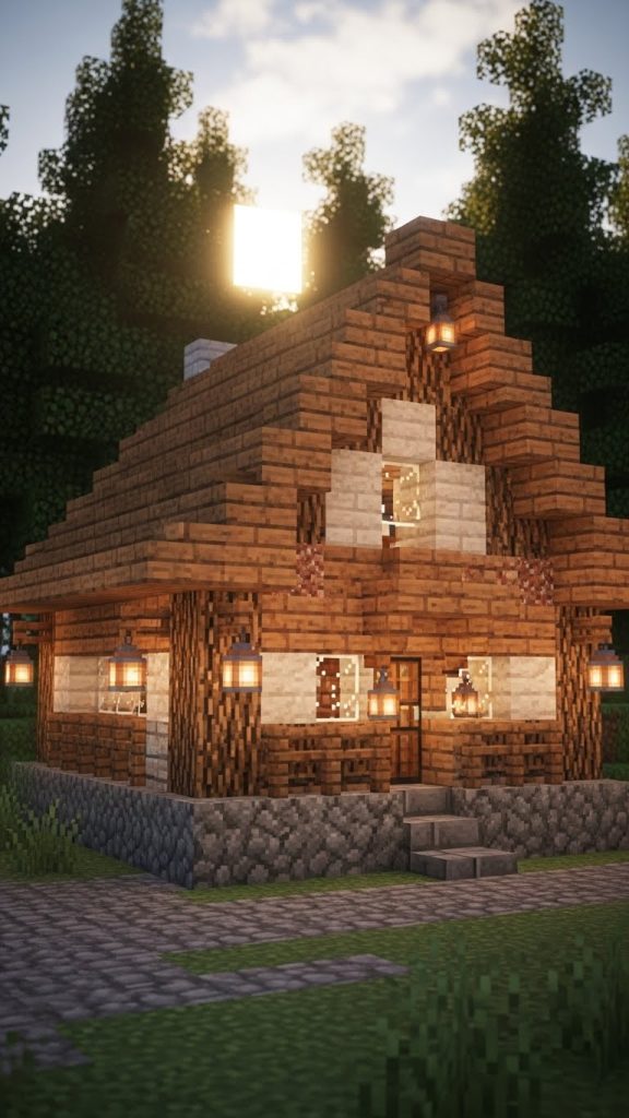
1. Cozy Cottage Neutrals 🍂
Soft, Warm & Timeless
This palette is perfect for countryside homes, starter bases, and peaceful survival worlds. Cozy cottage neutrals rely on warm browns, gentle creams, and muted earthy tones that feel safe and familiar.
Think of a small house tucked into a forest clearing, smoke rising from the chimney, lanterns glowing at dusk. This palette avoids harsh contrast and instead blends smoothly with natural biomes.
Key Blocks
- Spruce planks & logs
- Oak planks
- Stripped oak logs
- Smooth sandstone
- Cobblestone & mossy cobblestone
- Brown wool or terracotta
Why it works
These colors mirror real-world building materials. They age well, look good in all lighting, and never overwhelm the eye—ideal for long-term worlds.
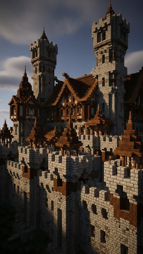
2. Medieval Stone & Timber ⚔️
Bold, Historic & Powerful
For castles, fortresses, and medieval towns, this palette brings strength and realism. It combines cold stone shades with dark wood accents to create dramatic contrast and believable architecture.
The focus here is texture as much as color. Rough stone surfaces paired with heavy wooden beams give depth and authority to large builds.
Key Blocks
- Stone bricks
- Cracked stone bricks
- Deepslate bricks
- Spruce & dark oak planks
- Polished andesite
- Iron bars
Why it works
This palette feels grounded and realistic. It tells a story of age, defense, and craftsmanship—perfect for roleplay or fantasy worlds.
3. Pastel Fairy Village 🌸
Soft, Magical & Dreamy
This palette is ideal for fantasy builds, fairy villages, or Pinterest-style aesthetic worlds. Pastels soften Minecraft’s blocky nature and create a whimsical, storybook feel.
Instead of realism, this palette focuses on emotion—gentle joy, creativity, and imagination.
Key Blocks
- Pink, light blue & lavender concrete
- White concrete or quartz
- Cherry wood
- Light gray wool
- Sea lanterns
Why it works
Pastels reflect light beautifully and photograph extremely well, making them perfect for Pinterest pins and thumbnails.

4. Desert Sandstone Harmony ☀️
Bright, Warm & Elegant
Desert builds shine when their palette is unified. This palette uses variations of sand and sandstone to create subtle contrast without breaking immersion.
It’s perfect for desert cities, temples, bazaars, and oasis villages.
Key Blocks
- Smooth sandstone
- Cut sandstone
- Sand
- Terracotta (orange, white)
- Acacia wood
- Gold accents
Why it works
Using similar tones keeps builds clean and professional while still allowing detail through texture and layering.

5. Dark Fantasy Nether Palette 🔥
Moody, Dramatic & Intense
This palette thrives in low light and high contrast. Inspired by the Nether and dark fantasy themes, it’s ideal for intimidating castles, villain lairs, or mysterious underground bases.
Key Blocks
- Blackstone
- Polished blackstone bricks
- Crimson planks
- Nether bricks
- Obsidian
- Lava lighting
Why it works
Dark palettes control mood. This one feels powerful, dangerous, and cinematic—especially when paired with shadows and glowing light sources.

6. Ocean Breeze Blues 🌊
Fresh, Calm & Coastal
Inspired by beach houses and seaside towns, this palette feels airy and peaceful. Blues and whites reflect the sky and water, making builds feel open and relaxing.
Key Blocks
- Prismarine
- Light blue concrete
- White concrete
- Birch planks
- Glass panes
- Sea lanterns
Why it works
Cool colors reduce visual noise and create a calm atmosphere, perfect for relaxing survival bases.

7. Forest Earth Tones 🌲
Natural, Organic & Immersive
This palette blends seamlessly with forest biomes. It focuses on greens and browns that feel untouched by civilization.
Perfect for ranger huts, treehouses, and hidden bases.
Key Blocks
- Moss blocks
- Green terracotta
- Oak & spruce wood
- Dirt & coarse dirt
- Leaf blocks
Why it works
It camouflages builds into nature while still allowing depth through texture variation.

8. Modern Monochrome 🏙️
Clean, Minimal & Stylish
Modern builds thrive on restraint. This palette limits color and emphasizes contrast through shape and lighting rather than decoration.
Key Blocks
- White concrete
- Black concrete
- Gray concrete
- Glass
- Smooth quartz
Why it works
Minimal palettes look expensive and intentional. They’re ideal for cities, villas, and futuristic builds.

9. Vintage Rustic Farmhouse 🚜
Warm, Lived-In & Nostalgic
This palette feels human. It tells a story of years gone by, weathered wood, and simple living.
Key Blocks
- Dark oak planks
- Bricks
- Terracotta
- Hay bales
- Copper (oxidized)
Why it works
Imperfections add charm. This palette embraces variation and age, making builds feel alive.

10. Ice & Snow Serenity ❄️
Pure, Cold & Peaceful
Perfect for snowy biomes, this palette reflects light beautifully and feels clean and quiet.
Key Blocks
- Snow blocks
- Packed ice
- Blue ice
- White concrete
- Spruce wood
Why it works
High brightness and low saturation create a calm, magical atmosphere.


